About the project
About the project
About the project
Challenge
How to visually communicate Curacao’s rich cultural heritage and natural beauty within a wine bottle design.Ensuring the design stands out in a competitive market while staying true to the spirit of Curacao.

Solution
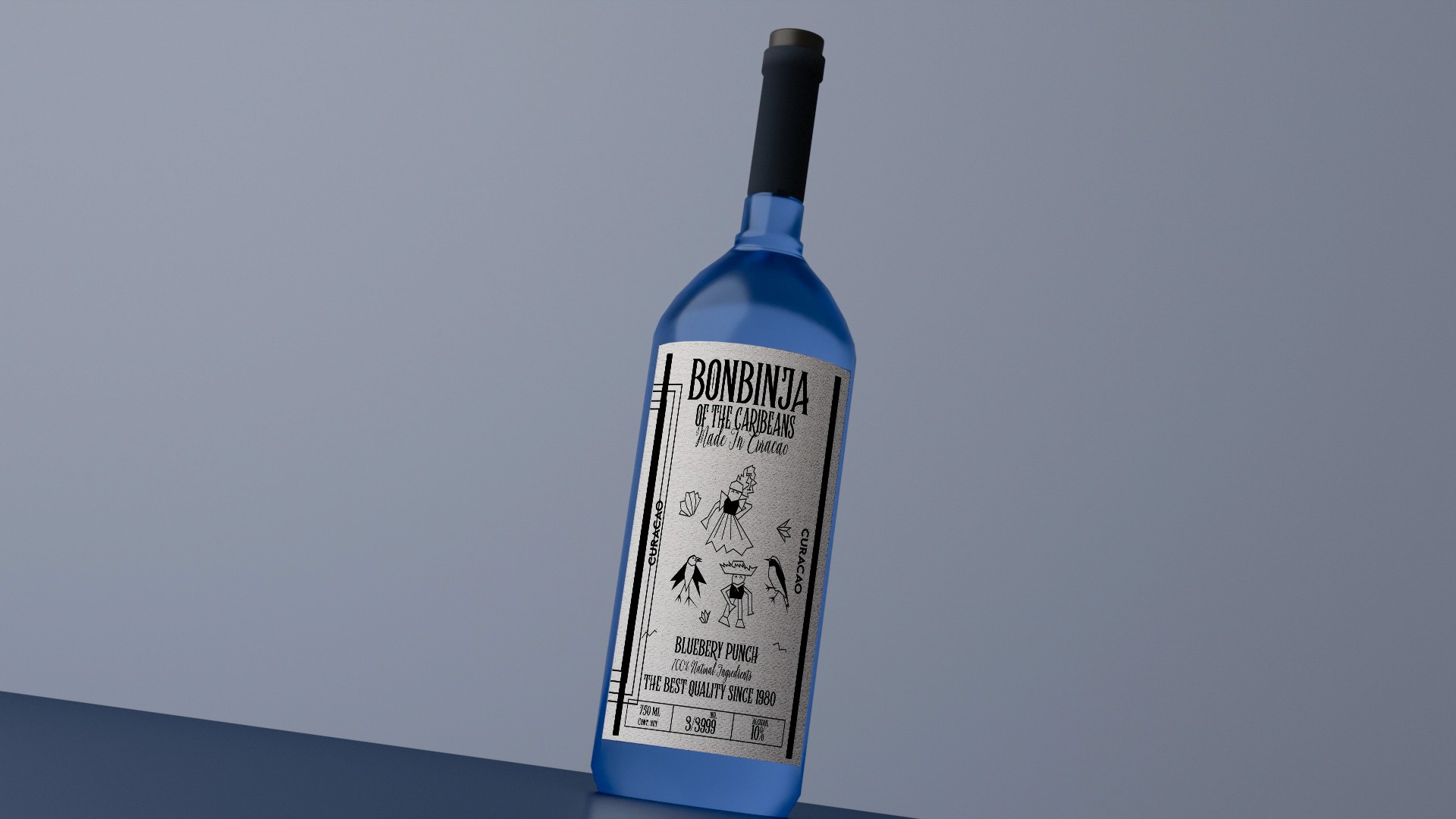
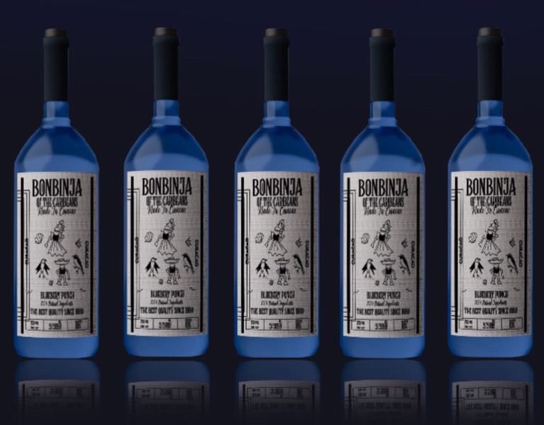
A blue bottle to symbolize Curacao’s iconic flag and its pristine blue waters, drawing a direct connection to the island’s identity. The label includes distinctive elements of Curacao’s cultural life, symbolizing the island’s vibrant wildlife and connection to nature + illustrating Curacao’s rich cultural heritage, with references to local attire, adding authenticity and a sense of place.

Target Audience Considerations
The design appeals to the 25-45 age demographic by combining modern design elements with local heritage. The geometric art style creates a more edgy look to the bottle. The use of natural motifs resonates with consumers interested in artisanal and authentic products, while the bottle’s bold color and striking imagery ensure it stands out on the shelf.
Typography
The wine’s name, BonBinja, is set in a bold, angular font with a slightly distressed texture, reflecting a tough, unapologetic attitude. This sharp, industrial style of typography contrasts with the natural elements of the design, creating a tension that grabs attention.
Challenge
How to visually communicate Curacao’s rich cultural heritage and natural beauty within a wine bottle design.Ensuring the design stands out in a competitive market while staying true to the spirit of Curacao.

Solution
A blue bottle to symbolize Curacao’s iconic flag and its pristine blue waters, drawing a direct connection to the island’s identity. The label includes distinctive elements of Curacao’s cultural life, symbolizing the island’s vibrant wildlife and connection to nature + illustrating Curacao’s rich cultural heritage, with references to local attire, adding authenticity and a sense of place.

Target Audience Considerations
The design appeals to the 25-45 age demographic by combining modern design elements with local heritage. The geometric art style creates a more edgy look to the bottle. The use of natural motifs resonates with consumers interested in artisanal and authentic products, while the bottle’s bold color and striking imagery ensure it stands out on the shelf.
Typography
The wine’s name, BonBinja, is set in a bold, angular font with a slightly distressed texture, reflecting a tough, unapologetic attitude. This sharp, industrial style of typography contrasts with the natural elements of the design, creating a tension that grabs attention.
