About the project
About the project
About the project
Challenge
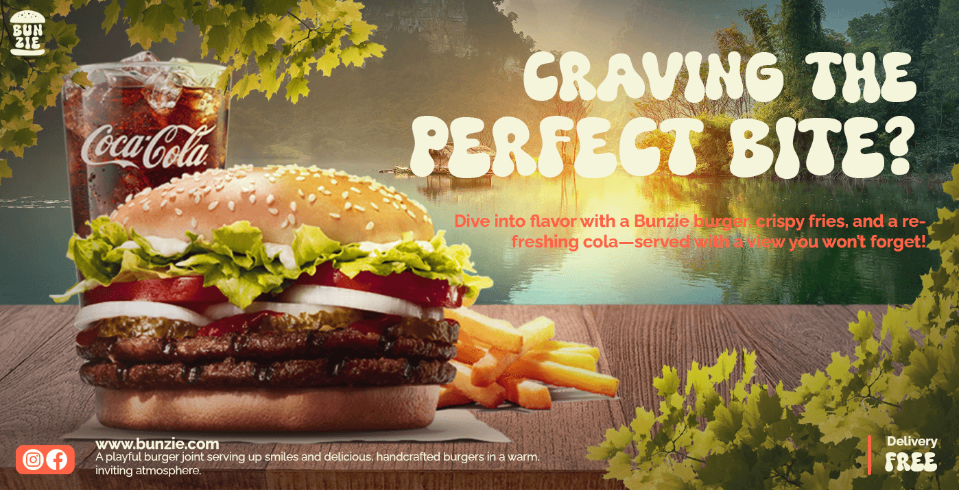
Making Bunzie’s branding feel playful without losing a sense of quality. The goal was to avoid looking overly childish while still appealing to a youthful demographic.
Solution
I balanced bold colors and a playful logo with clean, modern typography and simple designs. By choosing colors and fonts that evoked warmth and energy, I ensured Bunzie felt both fun and professional, like a go-to spot for comfort food.
Research + Design
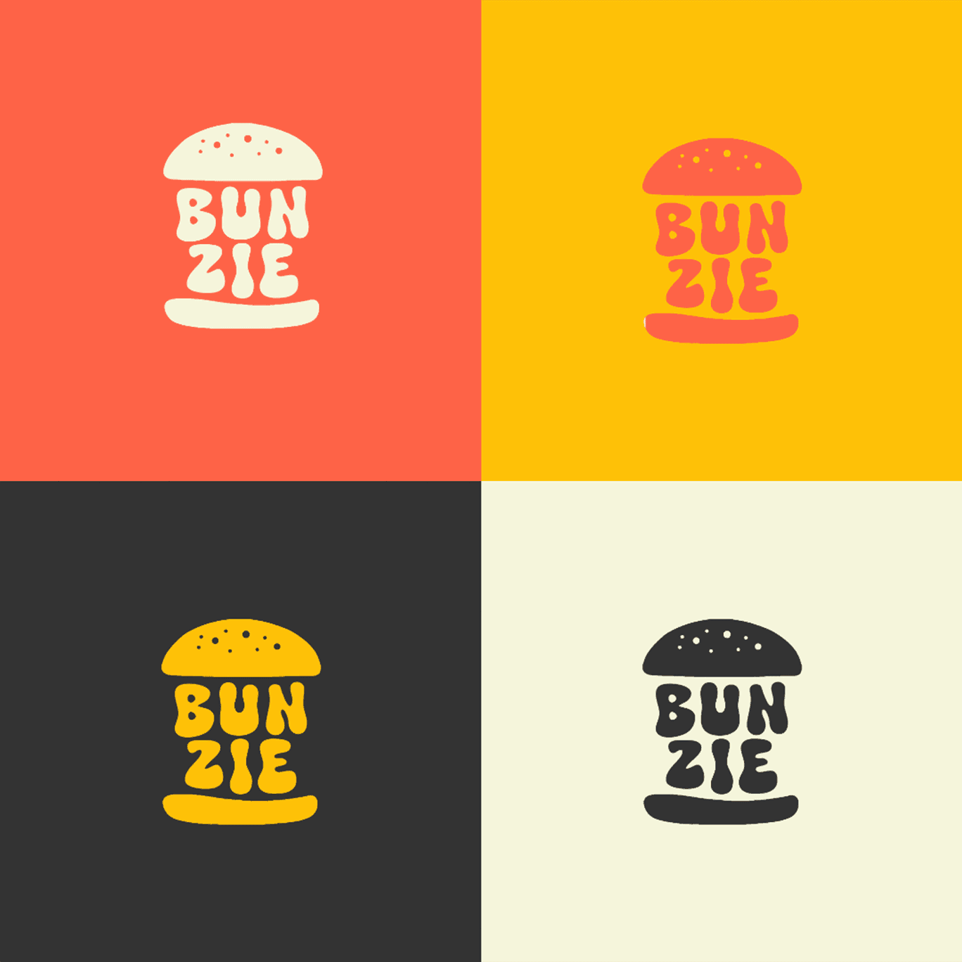
I began by researching current trends in fast-food branding, especially those targeting younger audiences. Brands that succeeded often had bold colors, memorable typography, and an engaging, casual tone. Based on this research, I crafted Bunzie’s identity to feel fresh, playful, and authentic.
Target Audience
Bunzie targets young adults and teens, aged 16-30, who are active on social media and looking for an affordable, satisfying meal in a fun environment. bunzie appeals to people who love grabbing quick bites with friends, enjoying great deals.
Main Tasks
The main tasks of this project included:
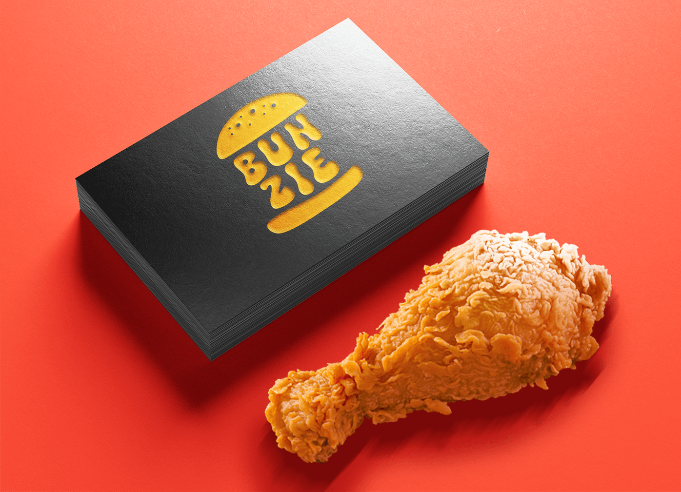
Creating a recognizable, unforgettable, playful logo and color palette that shows Bunzie’s identity.
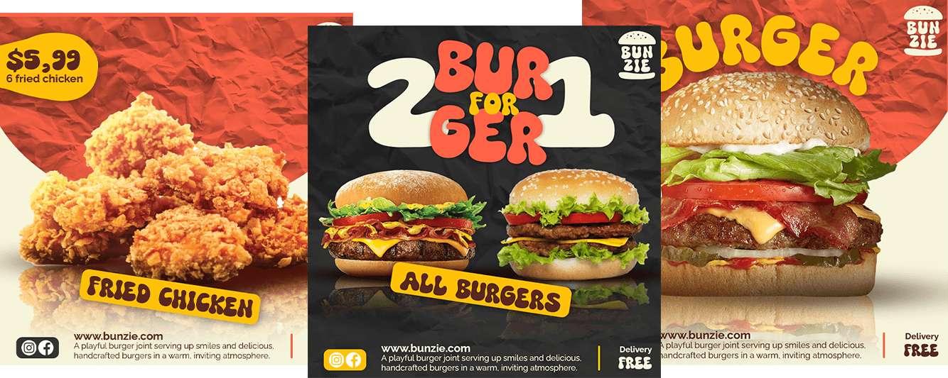
Designing engaging and interactive social media posts that resonate with the target audience.
Ensuring that every visual element, from typography to colors, aligns with the brand’s fun and lively identity.
Color Palette
Charcoal Gray
Adds contrast and a modern, neutral tone; used for text and backgrounds to balance brighter colors.
Rich Brown
A warm brown used for text, inspired by the look of buns, giving a friendly and inviting feel.
Bright Yellow
Attention-grabbing and energetic, perfect for highlighting deals and calls to action.
Beige
A light beige used as a background to create a cozy, comfortable atmosphere.
Challenge
Making Bunzie’s branding feel playful without losing a sense of quality. The goal was to avoid looking overly childish while still appealing to a youthful demographic.

Solution
I balanced bold colors and a playful logo with clean, modern typography and simple designs. By choosing colors and fonts that evoked warmth and energy, I ensured Bunzie felt both fun and professional, like a go-to spot for comfort food.

Research + Design
I began by researching current trends in fast-food branding, especially those targeting younger audiences. Brands that succeeded often had bold colors, memorable typography, and an engaging, casual tone. Based on this research, I crafted Bunzie’s identity to feel fresh, playful, and authentic.
Target Audience
Bunzie targets young adults and teens, aged 16-30, who are active on social media and looking for an affordable, satisfying meal in a fun environment. bunzie appeals to people who love grabbing quick bites with friends, enjoying great deals.

Main Tasks
The main tasks of this project included:
Creating a recognizable, unforgettable, playful logo and color palette that shows Bunzie’s identity.
Designing engaging and interactive social media posts that resonate with the target audience.
Ensuring that every visual element, from typography to colors, aligns with the brand’s fun and lively identity.

Color Palette
Charcoal Gray
Adds contrast and a modern, neutral tone; used for text and backgrounds to balance brighter colors.
Rich Brown
A warm brown used for text, inspired by the look of buns, giving a friendly and inviting feel.
Bright Yellow
Attention-grabbing and energetic, perfect for highlighting deals and calls to action.
Beige
A light beige used as a background to create a cozy, comfortable atmosphere.
